Mirror in Colony Harvest / 2012
|
Monday, October 29, 2012
Amber Cowan: Recycling “Colony Harvest” Tableware
Not content to follow a traditional path, today she is perfecting an original process involving flameworking, blowing, and hot-sculpting recycled, up-cycled, found and second-life glass. Her materials are typically American pressed glass from the 1940s–1980s, giving her work a vibrant sense of history with references to mid-century craftsmanship.
I’m particularly drawn to one of her recent pieces — Whole Milk Wash Basin in Colony Harvest. She created the piece by using found glass from the Lancaster Colony Corporation, a thriving American pressed glass manufacturer which operated from 1907–2002.
The Colony Harvest pattern was a quite popular line of opaque milk glass tableware produced from the 1950s–1980s. Back in the day, postwar consumers would acquire the tableware through S&H Green Stamps, a rewards and return system. Today thrift stores are inundated with the pattern, as preceding generations are replacing it with today’s modern wares.
“I reconstruct this glass and alter its original state while keeping intact the original vintage feeling,” Amber explains. “I wish to reference the history of the pressed glass industry and bring into focus the feeling of its past glory and forlorn future.”
The peaceful milky-white glass reincarnated into a complex composition definitely gives the Colony Harvest pattern new life.
Wednesday, October 24, 2012
Interview with Martha Davis
Marilyn Monroe once said, “Give the girl the right shoes, and she can conquer the world”. Every time I marvel over Martha Davis’s shoes, that quote comes instinctively to mind. Each pair is smartly designed, well crafted, comfortable and very sexy.
Trained as a product designer at Smart Design,
Razorfish, and her own company Able Design before segueing into the fashion
world in the fall of 2009, she leverages her industrial design expertise by fusing
hard-core functionality with unique sculptural possibilities to create some
very impressive shoes.
“I think of shoes as little products or
architecture for the feet—both share similar purpose of protection,
organization, and personality,” says the designer. An expert at looking for
solutions within a problem, she never loses sight of ways to keep the foot
secure and the wearer confident, while at the same time innovating with form
and experimenting with structure and materials.
“I look at where the foot needs to be supported
and where it doesn’t—then how the materials and shapes can be arranged in an
interesting way. I like a bit of tension—something unexpected—whether it’s in
the proportions, compositions, or materials,” Davis says.
This past winter, Martha was a resident at the
newly formed The Workshop Residence in San Francisco. This exciting collective
engages makers of all kinds: emerging and established, traditional and
unexpected, and invites them to collaborate with the Bay Area’s vibrant artistic
and craft communities. During her residency there, she blended industry and
craftsmanship to design three distinctive shoes. While all of the shoes use the
same vegetable-tanned leather and have similarities in the shape and
construction of the shoe, the key point of innovation is the design of the
heel.
“Kasha” features a heel with colored resin and utilizes the outer
part of a redwood tree trunk known as the “jacket”. This part of the tree is
considered waste product by sawmills, but Martha envisioned this beautiful and
striking substance as a way to give the shoes a truly bespoke feeling.
![]() |
Kasha |
For “Simone”, raw materials are carefully selected from the
undulating folds of Black Acacia wood harvested in the San Francisco Bay.
![]() |
Simone |
Finally, “Sugi” has an adjustable heel made with repurposed Douglas Fir. Additionally she constructs the shoe with wood originally used as brakes for San Francisco’s iconic cable cars. Due to the wear and tear, the brakes on the cable cars are replaced every 72 hours. Martha resurfaced the brakes and cut the heels directly from them—the stunning result is a stylish oval that swivels on a pin to two heel heights.
![]() |
Sugi |
Martha is joining forces with creative director
Susanna Dulkinys to create Dulkinys Davis, a new fashion label made in the USA.
The collection will consist of basics centered around leather, blending
traditional and innovation to create modern shapes and exceptionally
high-quality, handmade products. More on their collaboration in a future post.
With out further ado, here’s my Q&A with
the alluring and magical Martha Davis.
Job description: a forever student—i hope!
Why do you do what you do? i am a terminal non-linear thinker
How do you break through a creative block? look at stuff
Education: cornell art/arch/planning school: 82-84
risd: bfa sculpture 86
are sutoria: footwear engineering certificate
07
Mentors: my dad & tucker viemeister
World-saving mission: help people appreciate making things and live
more self sufficiently
Office chair: Eames
Office Soundtrack: Italian opera
Most useful tool: apple air book/ husquvarna sewing machine i got
as a gift when i was 17
Favorite space: the giardiniin venice
Favorite design object: paperclip
Guilty Pleasure: naps
Underrated: plumbing
Overrated: facebook
What did you learn the hard way? to love
If you could cross over into other profession…
what would you do? be an architect or a surgeon
Dream project: to start a factory that could employ all kinds
of people and give local vitality
Where’s home? san francisco
![]() |
Fall 2011
Labels:
fashion,
industrial design,
Martha Davis,
San Francisco,
shoe design
Friday, April 20, 2012
Q&A With Eva Hild
![]() |
Photograph by Carl Bengtsson |
When my eyes glide across Eva Hild’s astonishing ceramic sculptures, I feel a rush akin to being on a roller-coaster. The rise and fall of the paper-thin oversize forms, the swaying undulating waves that appear to be breathing— it’s a truly exhilarating experience. Needless to say, I enjoy the ride.
Hild’s work is hand-built and is made primarily from clay with a minimal color palette. “I try to relate my work to my life,” says the Swedish-born artist. “What is happening and how does it feel? Pressure. Slow. Strain. Ramification. Inside turn outside. As a starting point, I put words onto my feelings, and use the vessel form to translate this into three dimensions. The size of the form relates to my body. The thin walls are pulled and bent in different directions.”
Experience these poetically sinuous pieces yourself at Nancy Margolis Gallery in Manhattan. Here’s my Q&A with the enchanting and talented Eva Hild.
Job description: Shaping my life as a sculptor. Mostly and originally in clay but nowadays in any material that seems to be interesting, appropriate, possible and challenging. I work with the relation between inner and outer worlds, mind and matter, volumes and mass.
Why do you do what you do? I am interested in materials, shapes and the way objects could tell stories about life. I love to work with my hands and body. After a short period as a physiotherapist and ideas about being a physician, I throw myself happily (zestfully, with confidence) into the art-world. Clay was a good starter; non-exclusive and almost infinite possibilities. I tried everything during my first years at the art-university, but as time passed my aim was to really find my own path. I found a track in my inner landscapes, and I still follow.
How do you break through a creative block? My work is very time-consuming and I think I break any block by patience, endurance and hard work. On the other hand, this could also be the block; being stucked in the material, the extended time and the on-going process. I need periods of less dirty hands, and more intellectual work. I need to step back, reflect over and formulate my themes, get impressions from the outer world. My work is a flow, very much connected to my life. I am interested in this slow development. I try to be true and consistent, but also curious and struggle to reach new viewpoints.
Education: University of Design and Crafts in Gothenburg, Sweden. And by learning the hard way: mistakes always take you further...
Mentors: A lot of people in different positions and professions has been important in my artistic life. For example a supportive husband.
World-saving mission: Try your best (but do not be too harsh on yourself…).
Studio chair: Wood and metal from the 50s, from my grandfathers studio (rural painter).
Studio Soundtrack: P1 (talking, educational radio channel).
Most useful tool: My metal kidney.
Favorite space: Except my studio: In the airy forest, where the trees are high as in a colonnade hall, and the ground is covered with moss.
Favorite design object:
Citroën 2CV
Citroën 2CV
Guilty Pleasure:
Picking the best parts of the muesli...
Underrated:
Good and sustainable choices. Less is more.
Overrated:
Quick fixes.
What did you learn the hard way? How to transform one of my ceramic pieces into a bigger scale, in stainless steel…
Has your work ever got you into trouble? Things could go wrong (stainless steel sculptures can rust) and I could feel troubled, but most things finally get solved, one way or another. I really appreciate good co-workers and learning things. Experience gives confidence. Working with fragile materials in a 3-dimensional way always contains a risk; how to handle, ship and maintain? And at the same time: that is part of the content, expression and challenge.
If you could cross over into other profession… what would you do? I have already changed direction in my professional life; now I really look forward to explore and broaden the horizons in this area.
Dream project: An architectural big piece, performed in a supersustainable material with a team of professionals. To be able to experience the inner world in an outer world scale...This makes me think of another possible favorite space, where I have not been yet (on my wish-list): Cloud Gate of Anish Kapoor in Chicago Millennium Park.
Where’s home? Where I keep my collection of wool sweaters, rubber boots and parkas…
![]() |
Protuberance, stoneware, 2011, 90 x 56 x 69 cm |

![]() |
Track, stoneware, 2010, 105 x 50 x 40 cm |


Spine, stoneware, 2008-2009, 105 x 65 x 69 cm
![]() |
Eva working in her studio in Sweden. |
Tuesday, March 20, 2012
Q&A with Bob Recine

Bob Recine is one of the most creative and influential hair stylists working in fashion today. In fact, “hair stylist” doesn’t begin to do him justice — he is an artist and designer using hair as a material to create sculpture.
Unwilling to be bound by scissors and styling tools, Recine creates Dada-like assemblages using found objects like hairpins, sunglasses, paper, plastic, and headphones to produce eye-popping, provocative work. He collaborates with the industry’s most revered photographers, and has formed a creative alliance of sorts with Mario Sorrenti and Robbie Fimmano. Together they have blurred the line between art and fashion, conjuring arresting imagery for publications such as Another Magazine, American Vogue, Vogue Italia, French Vogue, Numero, Exit Magazine, I-D magazine, French Vogue, and V Magazine.
“For a person who they say is a ‘beauty expert’, I see it differently,” he said on Style.com. “[Beauty] comes in many forms, and its importance is how it’s utilized in the moment. That’s my perception and infatuation with beauty.”
You can view his captivating body of work in his recently published book Bob Recine: The Alchemy of Beauty, with photography by Mario Sorrenti, Robbie Fimmano and Bob Recine and an introduction by René Ricard. Personally, I can’t stop looking at it. Every time I dip into the pages something new emerges.
Without further ado, here’s my Q&A with beauty alchemist Bob Recine.
Why do you do what you do?
Hair Artist-Mystic Adventurer.
Why do you do what you do?
To search for higher levels of ALL.
How do you break through a creative block?
Never had one.
Education
High School.
Mentors
Art and Science are my true mentors.
World-saving mission
Higher understanding of creativity.
Studio chair
?
Creative Soundtrack
Anywhere from Mozart to the Sex Pistols.
Most useful tool
Confidence.
Favorite space
Outer Space.
Favorite design object
Anything that is not only beautiful but able.
Guilty Pleasure
Reading.
Underrated
Spirituality.
Overrated
Technology.
What did you learn the hard way?
All of it.
Has your work ever got you into trouble?
YES. Trouble is always present when you have a vision and passion, as things confront our senses we confront them back, there are too many stories here.
If you could cross over into other profession… what would you do?
I’m constantly crossing over but never really notice.
Dream Project
Alchemy of Beauty
Where’s home
NYC.

The cover image featuring model Vivien Solari and photographed by
Mario Sorrenti was originally made for Numero magazine in 1996.

Untitled, ink on paper, 7 1/2 x 7 1/2 in., 2007 /
Tanya Dziahileva, photo by Mario Sorrenti, Spring 2007.

W Magazine, Eniko Mihalik, Photo by Mario Sorrenti, April 2009 /
Untitled, collage on paper, 10 x 13 1/4 in., 2008.

Exit Magazine, Rebekah Davies, Photo by Recine, Fall 2004 /
Untitled, Tempra on Paper 3 3⁄4 x 6 1⁄2 in. 2004.

Vogue Italia, Sasha Pivovarova, Photo by Mario Sorrenti, April 2008 /
Untitled, Ink on Paper 5 ¼x 8 ¼ in. 2007.

Untitled, ink and tempra on Paper 8 x 10 1/2 in. 2008 /
V Magazine, Tanya Dziahileva. Photo by Mario Sorrenti, Spring 2007.

Untitled, Tempra on Paper 10 x 13¼ In. 2008 /
Ingrid Mask, Photo by Robbie Fimmano, 2007.

Vogue Italia, Gemma Ward, Photo by Mario Sorrenti, July 2006 /
Hairpin Sculpture by Recine, Photo by Robbi Fimmano, 2008.
Untitled, 690 Polaroid 3 ½ x 4 ¼ in. 2004 / Untitled, 690 Polaroid 3 ½ x
4 ¼ in. 2000 / V Magazine, Tanya Dziahileva, Skirt Created by Philipp
Haemmerle, Photo by Mario Sorrenti, Spring 2007.

Untitled, lipstick and powder on draft paper, 12 1/4 x 24 in., 1996 /
Natalia Vodianova, photo by Mario Sorrenti, 2007.

Numero, Vivien Solari, Photo by Mario Sorrenti, 1996 /
Untitled, Tempra on Paper 25 x 40½ in. 1998.
Sunday, February 26, 2012
Q&A with Michael Gillette
The beautifully executed artwork of Michael Gillette is, simply put, absorbing. Michael marries drawing and painting skills with an aesthetic underpinned by a love of popular culture, most specifically music. His sly sense of humor and artistic style creates haunting, cerebral work that isn’t easy to categorize. Never one to follow conventional paths, he was kicked out of art school in England for refusing to see the difference between graphics and illustration (it probably didn’t help matters that he was caught using the school’s printers for his own band’s album cover art). For the last 20 years he has been brilliantly visualizing the unreasoning vibrations of music, working with Elastica, Beck, The Beastie Boys, MGMT, and Paul McCartney to name a few.
Currently I am fortunate enough to collaborate with Michael on his monograph, appropriately titled “Drawn in Stereo”, to be published in 2013. In the meantime, here’s my Q&A with the inimitable Michael Gillette.
Job description: Artist.
Why do you do what you do? When I was a kid I fell in love with drawing and the way it made me feel, and there has been nothing that has come along since that has been as enjoyable so here I am.
How do you break through a creative block? I trust that creativity is a natural state. If there is something blocking it- that it is me. So, I try to figure out why and how I'm doing that. I used to do the Artist Way morning papers, where you write down your stream of consciousness. That has helped. I try and keep a very keen ear to whatever bullshit I might be thinking and nip it in the bud because I I know full well the ditches that lie either side of the highway. I wrote this to remind myself of some pitfalls which block creativity.

Education: I went to a British art school, so I consider myself almost entirely self taught. Thank the lord for the Public Library system of San Francisco.
Mentors: Roger Law is probably the closest person I have to a mentor. He was an illustrator in the 60’s, then went on to helm a satirical T.V. show which evolved around the caricature puppets he made. Now he’s a heroic ceramicist. We email sporadically, but he's always been a very generous and supportive person and I really dig him. He’s a force of nature and he keeps making work that is is plugged in and openhearted with a sly sense of humor.

World-saving mission: hah! I’m trying to save myself.
Office chair: I have a Aeron chair which I bought when I first moved to San Francisco, it was just after the dot bomb, so you could walk in to empty offices full of them and buy them on the cheap. I’ve recently switched back to an armless Knoll Pollock, the arms on the Aeron kept bumping in to my desk.
Office Soundtrack: BBC Radio 2,3,4 & 6 KCRW, Dunwich Radio.
Most useful tool: My brain.
Favorite space: I really love the inside of the Chapel At Sea Ranch. Actually all of Sea Ranch is aright by me, I love the Rec centres too. My wife describes it as communism for rich people.


Favorite design object: 1965 Epiphone Casino.

Guilty Pleasure: I don’t believe in Guilty Pleasures— if something is enjoyable, fair enough, I’m done being cool.
Underrated: Intuition.
Overrated: Technology.
What did you learn the hard way? That everybody is making it up as they go along, so there is no reason to feel insecure.
Has your work ever got you into trouble? Not since I was caught drawing an unflattering portrait of my French teacher on a rainy day in 1983.
If you could cross over into other profession what would you do? I always wanted to be a musician, or some kind of performer, but I’m happy making art, I’d like to do so more autonomously.
Dream project: I have an idea for an animated show which I’d love to see happen
Where’s home? Currently it’s very much San Francisco, I love this city so much, but I'm probably in the later days of being here, but I won’t stray far. California is really part of my mindset. I still have feelings for Wales where I grew up and am grateful that I got to live there too.
“The Little Angels” is an ongoing series of simple watercolours depicting recently deceased stars in the prime of their childhood. “The criteria is that the stars must have died at an early age, and the images must capture them before they are cognizant of their own image. My hope is that the sweet nature of the pictures and the tragedies that link them will invite the viewer to question both our obsessions with stardom, and the belief that fame is a cure all,” says Michael.

Beck for the his album “The Information”. Jean Michel Basquiat for the LA MOMA.

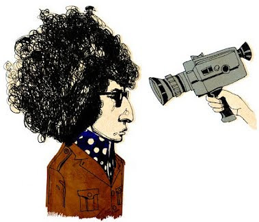
Bob Dylan from “Music Listography” published by Chronicle books.

“At home with Charity” painting for an exhibition.

“Happy Place” experimental work.


Video animation stills for the “Beastie Boys 5 Boroughs” album.

Dum Dum Girls, personal work.

Tommy Lee for Spin magazine.


B is for Beatles, for an illustrated alphabet exhibition in Dublin curated by Print Process.

Personal work.

“Drive” poster and cover for the film magazine, Little White Lies.

The 3 Disgraces, cover for Centerfold magazine.
A sampling from Michael’s sketchbook.

A possible cover for Michael’s book, “Drawn in Stereo” coming in 2013.
Link to Michael’s site.
Labels:
artist,
illustrator,
Michael Gillette,
music
Subscribe to:
Posts (Atom)